

WHY MOST PERFORMANCE SCORES DON'T CHANGE ANYTHING
Most operations dashboards can rank people. Far fewer can explain the ranking in a way the person being ranked would agree with. A number on a leaderboard, with no context for how it was reached, reads as judgment rather than feedback — so it gets ignored, or worse, it gets argued with instead of acted on. We built performance management into our Digital Ops Platform with the opposite goal: every score should come with its own explanation, built from the same ticket data the engineer already knows.
A number on a leaderboard, with no context for how it was reached, reads as judgment rather than feedback.
SCORE, THEN SHOW YOUR WORK
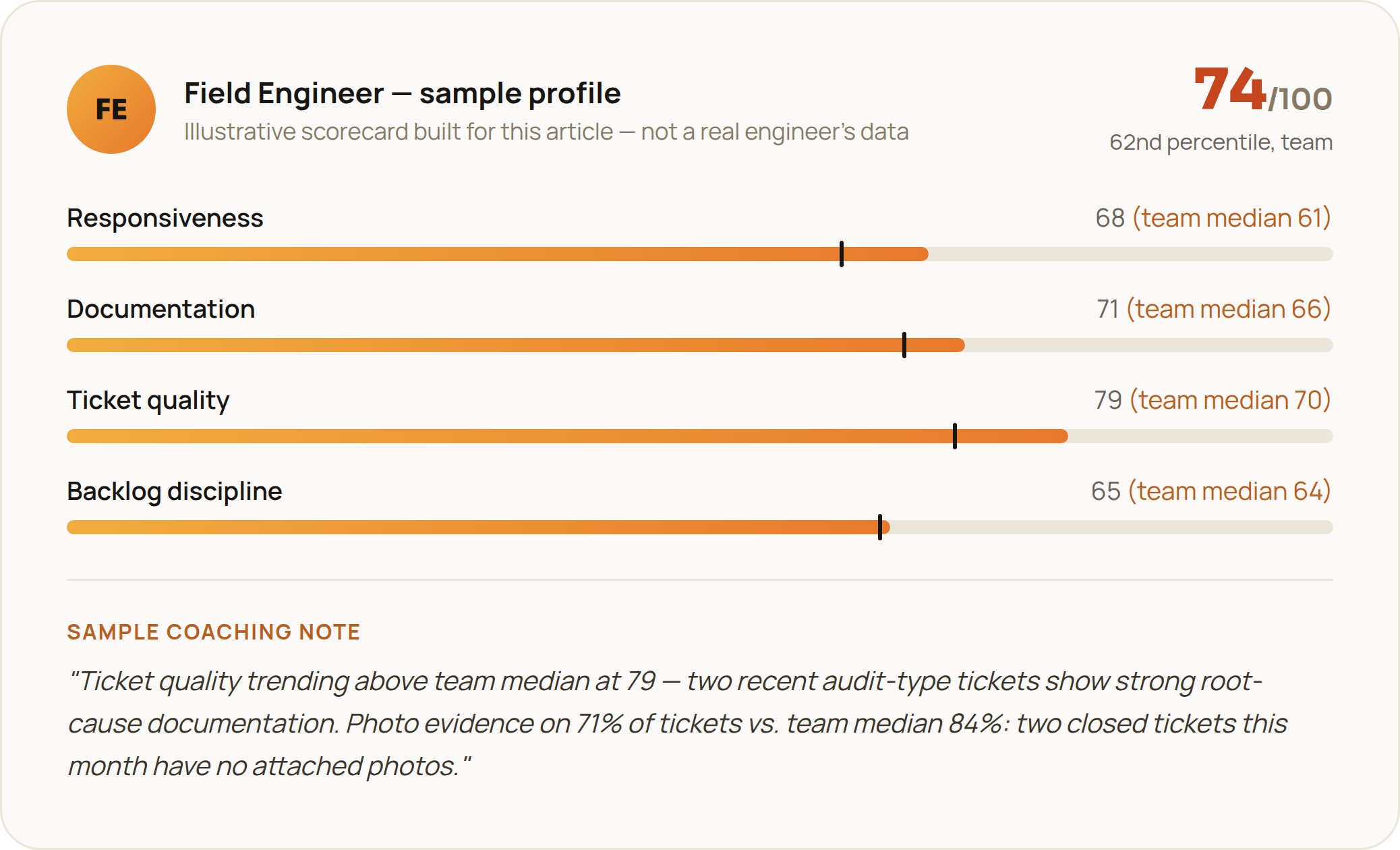
Every field engineer's rating breaks into a handful of measured dimensions — responsiveness, documentation quality, ticket handling, backlog discipline — each benchmarked against the team's own median, not an arbitrary target. Alongside the score, the platform generates a plain-language coaching note that cites the specific tickets behind it: what went well, what didn't, and which jobs illustrate each. It's the difference between "improve your documentation" and pointing at the two tickets last month that were closed without photo evidence. One is a grade. The other is something a person can actually act on.
FROM INDIVIDUAL TO TEAM, WITHOUT LOSING THE INDIVIDUAL
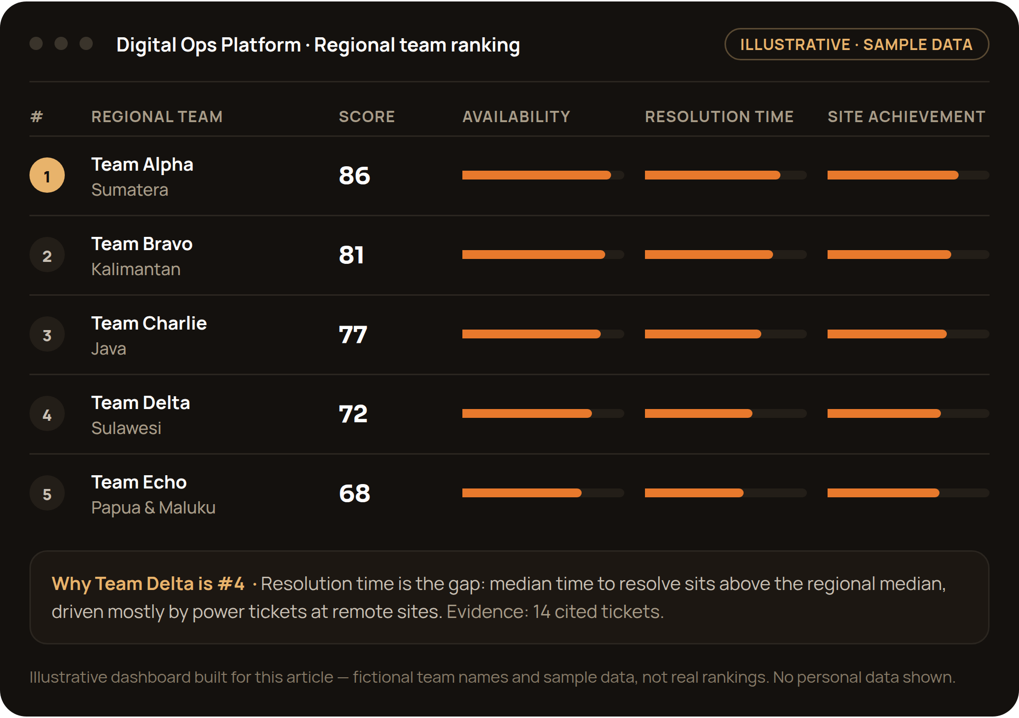
The same evidence rolls up a level: regional teams are ranked on a composite score across weighted operational metrics — availability, resolution time, site achievement — refreshed on a rolling basis, with the full methodology published on the same screen as the leaderboard, not hidden behind it. And it isn't only a top-performer board. A separate "most improved" ranking exists specifically so a team climbing from a weak starting position gets recognized for the climb, not just measured against teams that started ahead.
BUILT-IN HONESTLY ABOUT ITS OWN DATA
The same system that ranks performance is also built to flag where its own data isn't good enough to trust yet — a metric running on partial inputs, a category with too many uncategorized tickets to be meaningful. We'd rather show a manager where the data is incomplete than let a clean-looking chart imply certainty that isn't there. That habit of self-auditing, more than any single score, is what makes the numbers worth using for real decisions instead of just reporting.
We'd rather show where the data is incomplete than let a clean chart imply certainty that isn't there.
WHY THIS MATTERS BEYOND THE LEADERBOARD
This is the same engine behind the MTTR and resolution-time numbers we report in client case studies — performance management isn't a side dashboard, it's how the operational commitments in a Managed Services SLA actually get kept, ticket by ticket, site by site, engineer by engineer.